Starting with .NET MAUI 10, you can opt your Android app into Material 3 (a.k.a. Material You) styling with a single MSBuild property. Material 3 is already live in a large set of controls today, more are on the way in upcoming service releases, and the plan is for it to become the default for Android in a future version.
In this post I’ll walk you through how to enable it, what controls are covered today, and what’s coming next.
If you prefer watching over reading, I’ve got a video walkthrough as well:
What is Material 3 again?
Material 3 is the latest version of Google’s Material Design system. Compared to Material 2 it brings:
- Dynamic color schemes that adapt to user preferences and system themes (the “Material You” part)
- Refreshed component shapes, elevations, and focus states
- More flexible customization through Material’s color tokens
Without enabling Material 3, your .NET MAUI Android app continues to use Material 2 styles — everything still works, but enabling Material 3 brings your controls in line with the latest Android platform conventions.
Note
Material 3 in .NET MAUI is Android-only. iOS, Mac Catalyst, and Windows continue to use their native design systems, exactly as they should.
Enabling Material 3
Material 3 support requires .NET MAUI 10 — you need your project targeting net10.0-android (and the other net10.0-* TFMs).
Material 3 work has been landing incrementally across service releases: the build property and basic styles shipped in SR3 (10.0.30), CheckBox support in SR4 (10.0.40), and the biggest wave — Button, Entry, SearchBar, DatePicker, Slider, ProgressBar, ImageButton, Switch, and Shell theming — all landed in SR6 (10.0.60).
For the most complete experience, make sure you are on version 10.0.60 or later of the Microsoft.Maui.Controls NuGet package.
Once you are on .NET 10, this is the easy part. Open your .csproj and add a single property to a <PropertyGroup>:
<PropertyGroup>
  <UseMaterial3>true</UseMaterial3>
</PropertyGroup>
That’s it. Rebuild your app, deploy it to an Android device or emulator, and the supported controls will start picking up Material 3 styling automatically. No handler customization, no custom renderers, no Resources/values/styles.xml surgery required.
Material 3 styling only affects the default appearance of controls. Any colors or styles you have explicitly set in your XAML or C# — like BackgroundColor, TextColor, or custom handlers — still take precedence. Your brand stays your brand.
And if you try it and decide it is not for you yet? Just remove the <UseMaterial3> property from your .csproj (or set it to false). The default is false, so your app goes right back to Material 2 styling on the next build — the same look your app has today without any changes.
If you’d like to see the property in context, here is a trimmed .csproj:
<Project Sdk="Microsoft.NET.Sdk">

  <PropertyGroup>
    <TargetFrameworks>net10.0-android;net10.0-ios;net10.0-maccatalyst</TargetFrameworks>
    <TargetFrameworks Condition="$([MSBuild]::IsOSPlatform('windows'))">$(TargetFrameworks);net10.0-windows10.0.19041.0</TargetFrameworks>

    <OutputType>Exe</OutputType>
    <UseMaui>true</UseMaui>
    <SingleProject>true</SingleProject>
    <ImplicitUsings>enable</ImplicitUsings>

    <!-- Enable Material 3 design on Android -->
    <UseMaterial3>true</UseMaterial3>
  </PropertyGroup>

  <ItemGroup>
    <PackageReference Include="Microsoft.Maui.Controls" Version="$(MauiVersion)" />
  </ItemGroup>

</Project>
If you want to see it on a real, running app instead of just imagining it, there is a Material 3 demo sample that puts most of the affected controls on a single page. Clone it, run it on Android, and toggle UseMaterial3 on and off to see the difference side-by-side.
What it looks like
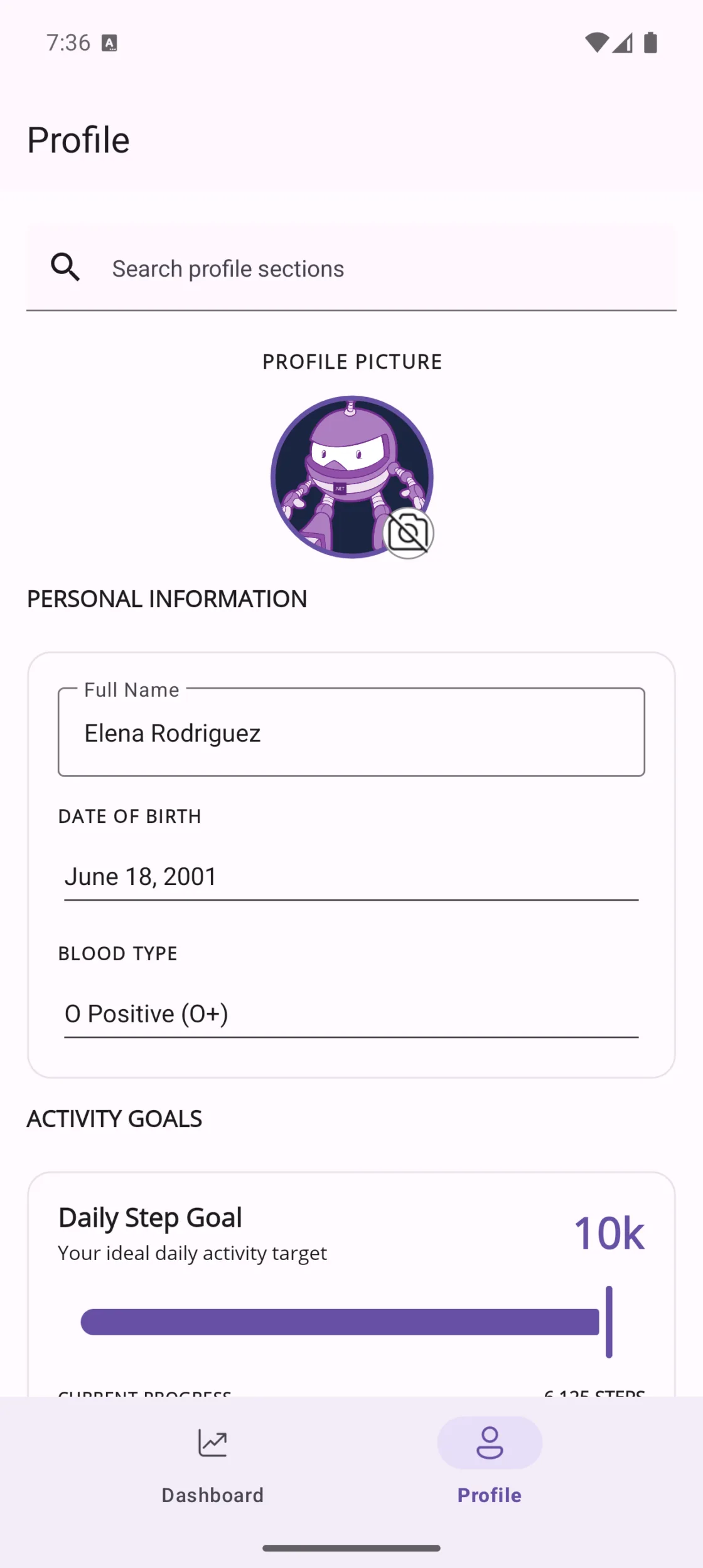
Here is the Material 3 demo sample running on Android in both light and dark themes. You can see the updated styling across SearchBar, Entry, DatePicker, Picker, Slider, ProgressBar, RadioButton, CheckBox, Switch, Button, and ImageButton — all from that single UseMaterial3 property.
| Material 3 light theme | Material 3 dark theme |
|---|---|
 |
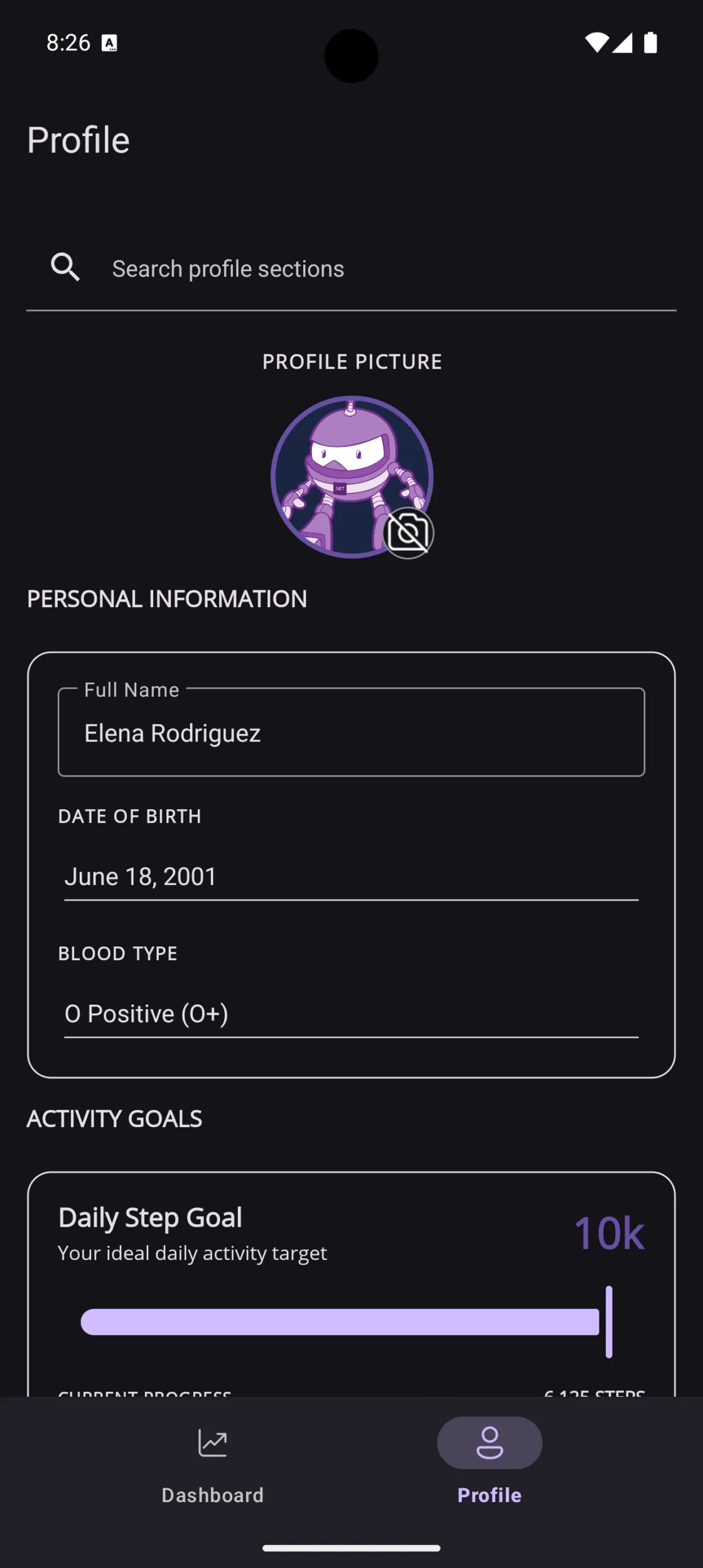 |
The controls that get the most dramatic visual changes are:
- Entry & Editor — switch from the classic underlined
EditTextto Material 3’s outlinedTextInputLayoutwith a floating label - SearchBar — becomes a proper Material 3 inline text field with a leading search icon and a trailing clear button
- DatePicker — the legacy spinner-style dialog is replaced by Google’s
MaterialDatePickerfull-screen calendar overlay - TimePicker — uses the Material 3 clock dial dialog with the Material You color scheme
- Slider — gets the new Material You track and thumb design
- ProgressBar — rendered using Material 3’s
LinearProgressIndicator - RadioButton, Picker — adopt Material 3 color roles and visual feedback automatically
For a detailed side-by-side comparison of each control with Material 2 vs Material 3, check out the official documentation.
What is not (yet) covered
The first wave of Material 3 work focused on the controls where the visual delta between Material 2 and 3 was the largest, and where we needed dedicated handler changes to swap in the underlying Material components.
That covers a wide range already — Entry, Editor, SearchBar, Picker, RadioButton, TimePicker, DatePicker, Switch, ProgressBar, ActivityIndicator, Slider, Image, ImageButton, Button, CheckBox, Label, and Shell all have Material 3-aware handler code.
Other controls like Stepper and CollectionView will pick up Material 3 colors via the underlying Android theme when you enable UseMaterial3, but they don’t have dedicated Material 3 handler work yet.
For the current queue of follow-up work, including controls and navigation surfaces that still need dedicated updates, follow the Material 3 tracking issue.
There are also a few things that are being tracked separately:
- Per-control opt-in. Today
UseMaterial3is an app-wide switch on Android. There is no per-control or per-page toggle. Follow the Material 3 tracking issue for status. - Dynamic color tokens via .NET MAUI APIs. The system honors Material You dynamic colors at the Android theme level, but there is no .NET MAUI API surface yet for working with Material 3 color roles directly from your XAML or C#. Follow the template and color-token issue for API and template feedback.
- Navigation chrome and collection views. Things like
NavigationPage,TabbedPage,FlyoutPage,CollectionView, andFrame/Borderare not specifically restyled for Material 3 in this release. Follow the handler-based Shell work and related Material 3 flyout issue for current progress.
The active plan is for Material 3 to become the default Android styling after the tracked gaps are resolved. Watch the Material 3 tracking issue and related follow-ups for implementation status and priorities. Which is a great segue into…
Try it today, and tell us what you find
This is exactly the kind of feature that benefits from being run against real apps with real screens. The sooner you try it on yours, the sooner we can spot the rough edges that don’t show up in our sample app.
How to evaluate Material 3 today:
- Add
<UseMaterial3>true</UseMaterial3>to a branch of your app. - Run through your most-used screens on a few Android API levels (especially Android 12+ where Material You really shines).
- If something looks off, please open an issue on the .NET MAUI repo. Screenshots and a small repro are gold.
If everything Just Works, that is also great signal! Drop a note on the issue tracker or ping me on socials so we know which scenarios are already in good shape.
Summary
Material 3 support in .NET MAUI 10 is one of those rare wins where you flip a single property and your Android app immediately looks more at home on the platform.
Today it covers Entry, Editor, SearchBar, RadioButton, ProgressBar, Slider, Picker, TimePicker, DatePicker, CheckBox, Switch, ImageButton, Button, and Shell, with the rest of the surface picking up Material 3 colors via the Android theme. There is more to come, and your feedback is what shapes where we go next.
Go enable it, file the issues you find, and let’s make .NET MAUI on Android feel as fresh as the platform underneath it.
References
- .NET MAUI Material 3 documentation
- .NET MAUI Material 3 sample
- Material Design 3 Components
- .NET MAUI on GitHub
The post Give Your .NET MAUI Android Apps a Material 3 Makeover appeared first on .NET Blog.